8.31am Wednesday 21st March 2018
I receive an email from Stan’s Cafe on Wednesday morning. It’s from Laura: “Hi Simon. I’m getting in touch again because we wondered if you could manipulate this image for us to send to The REP on Friday?”
The image she’s referring to is this:

The image is for The Capital, Stan’s Cafe’s new show produced in association with Birmingham Repertory Theatre. I already know a bit about this. I was in Birmingham in October working on What When when James gave me a sneak preview of their new toy for the show.
Wedged into the rehearsal space is a massive travellator. James grins and turns a switch to propel several chairs backwards and forwards. This makes me grin too. I experienced the same childlike thrill the other day when the septic truck guy asked me to crank the pump lever on the septic truck. James and I obviously share a love of heavy machinery. Or we’ve never quite outgrown the playground.
After sending a dustbin gliding majestically across the rehearsal space, like a reject Dalek on a catwalk, James strides purposefully against the movement of the travellator – a man on a mission but staying in one spot. I can see the dramatic potential of this idea and I love it.
It’s then that James lets slip the big revelation. There will be not one, but two travellators in the show. I immediately see double the potential – chairs going one way and bins going the other. I’m certain that James has vastly more ambitious plans than this, and I can’t wait to see what will happen. He glides back towards me, flicks the switch to slow to a halt and outlines the concept behind show.
“The Capital is about the inequalities of life in a big city,” he explains enthusiastically. “It’s also a bit about property speculation, the construction of a big tower block and Capitalism in general.”
The whole idea sounds fantastic. I begin to imagine what they might conjure up with the two travellators, but in the back of my mind I’m also thinking what I might use a travellator or a Dalek for if I had one at my disposal.
When I return to Canada, James emails to ask me to provide a logotype for the show, as I’ve often done in the past, and to develop some visuals for their upcoming photoshoot. He mentions that he likes the skyscraper typography in the poster for the Woody Allen movie Manhattan, and tells me that chairs are a motif for the show. He forwards a brief for the photoshoot which reads: ‘Image of a woman “trying to do too much” pushing a pram, while on the phone, carrying a briefcase, clipboard and takeaway coffee while eating a sandwich. Rather than having a “real-life” setting for this photographic image we would like it to be placed over the top of a detailed city planning image or the images of an architectural plan.’
I type ‘stressed business woman’ in my search bar, and Google helpfully adds ‘doing too much’. I’m confronted with page after page of stock portraits of business-suited women screaming, tearing their own hair out and banging their heads on desks, because obviously that’s what business women do when they’re stressed. All this Munch-like screaming, hair-tearing and head-banging is wildly inappropriate, and I also need a full-length shot. It’s only for a mock-up at this stage, so I choose the least ridiculous stock photo and put together this:

I’m hoping the image conveys a sense of a woman ‘trying to do too much’ and adds a sense of claustrophobia, of city walls or tower blocks closing in around her. Meanwhile, the typography carries the idea of the travellators, chairs as a motif, and captures the sense of a city skyline without attracting the attention of Woody Allen’s lawyers – although I’m sure they have more pressing matters at hand. I offer two visuals at this point. One has the grey hues of concrete, whilst the other is red. I prefer the grey version, but for marketing purposes the red will stand out more. I email the two images over.
All goes quiet for a couple of months until I receive Laura’s email containing the new photograph they’ve commissioned for the show. Usually I’ll get an image and some promotional text for the show and I’m given free rein to design flyers and posters. This time there is no text, only the image, which will need cutting out and placing over a new background.
Unfortunately I can’t download the high resolution image as I don’t have the correct password. I get this 24 hours later, which leaves me one day to complete the design and get it to The REP tomorrow. And unfortunately this is where I go off at a slight tangent. Whether it’s the proximity of the deadline or the fact that they’ve asked for an image for The REP brochure rather than asking me to design a poster and flyer, I’m not quite sure. But when you head off in the wrong direction, that error is compounded with each subsequent step.
One of the things that was stressed in the photography brief was a feeling of motion, speed and energy. I want to create an image that reflects this and captures the vibrance, colour, motion and chaos of a city. I look back at the previous visuals I supplied and decide that the new photograph of the business woman doesn’t quite fit the background and that the previous visuals look too dull and flat.
I design the following image, and email it along with the rationale behind it: “I’ve tried to respond to your photo treatment brief and give it a feeling of claustrophobia, busyness and movement – a sense of being overwhelmed or trapped and ‘trying to do too much’ as you requested, along with the ‘speed and energy’ that you requested.”

I grab some lunch, but when I return to the design I don’t like it. The image looks okay full-size on my monitor but at a smaller size it doesn’t work.
James has also responded: “I think this is very striking and really dynamic – I wonder if there’s a way of also undercutting it a little somewhere as this looks very corporate and we put her plastic bag of shopping in there to have a sense of domestic life being part of the deal. Her work day may be in Canary Wharf but she has to go home one the tube to Tooting and the phone call may be to a childminder or Mum or teenage kid not the stockbroker… just to add to your challenge!”
I suspect that James is being diplomatic in his response. Where he sees ‘striking’ and ‘dynamic’, I see a chaotic mess. I take on board his suggestions, but I get lured by the London references in his reply. I imagine a woman rushing through a labyrinth of Underground tunnels, shuttling between meetings and home. I refine the image and add some tube trains and falling cans of beans for good measure, with the bonus that the trains replicate the gliding motion of the travellator. It’s late evening when I email this image:

The following morning I wake to messages from Laura and James.
Laura: “We really like the concept… We wondered if the image could look a little less London centric? Would it be possible to disguise the tube trains to look more generic? We just want it to appeal more regionally. Is it possible to hide the branding on the tins? Thanks Simon, the image is great.”
James: “Just chucking a 2p worth in here – it’s not essential the trains are ‘generic’ they could be identifiable as West Midlands trains, it would just be great – even though (in fact BECAUSE) the show is called The Capital – if it doesn’t read as a show that’s set in London – you know how us provincial types get all funny about London types!”
They really like the image with the trains. Excellent. This would be great news if it wasn’t for one small problem: I hate it. Again, after some time away, I’ve come back to a design to discover I don’t like it. I find this can happen in any art form, be it design or theatre. When I’ve worked on The Steps Series with Stan’s Cafe, what we think is a brilliant idea one day sometimes feels weak or even absurd when we return to it afresh the following day.
I know I could simply drop in some different trains as requested. Everyone would be happy with this and I could take the Friday afternoon off to go skiing. I’m all too aware that the deadline is today, but I don’t like the image enough to let it go.
I try to define what I like and what I don’t like about the image. I like the idea of the woman teetering on the abstract platform as though she’s on a moving travellator and struggling for balance, but I don’t like the perspective or the way the two trains are working in the background. I think it will still read as the London Underground whatever replacement rail service is dropped in.
I decide to look for a different background with more depth. I search through stock photography but it has to be free, so there is sometimes the frustration of finding the perfect image and then discovering it wildly exceeds our budget. Fortunately I find a free image of a train station that I like. I overlay some buildings and architectural plans on different planes to the woman and train station. I want to make the image disorientating so people have to look twice to figure out what’s going on. I send this over with the accompanying message: “Sorry to do this to you, but I came back this morning and took on board about what you were saying about the tube trains and thought it wasn’t working as well as I’d hoped. So… I found another background image. I think this works better. I think it’s clearer, stronger and more gritty. A bit more ‘Stan’s’.”

Over the years, we’ve developed ideas of what the Stan’s Cafe visual aesthetic might be. We’ve never formalised this and I’m reluctant to attempt it. If forced at gunpoint, then words I would consider might include: authentic, real, urban, gritty, unfussy; but even from 3,500 miles away I can feel James bridling at any ham-fisted attempt to pigeonhole the company so I’ll stop there before I do find myself at gunpoint.
I like this new image. However, as I’m about to find out from James, it’s for a completely different show.
James: “I’m sorry this is all a bit rushed – it being The REP brochure not our flier or poster we somewhat underestimated the design dimension of ‘just dropping something behind it’! Anyway. I can see why you like the platform thing but I’m afraid I think this is a non-starter as it really suggests a moment that people will see in the play, whereas the previous version is clearly more impressionistic. It does get the gritty thing but there feels like less movement than in the abstract version.”
Now I’m slightly confused. This image is only for The REP brochure and not for the subsequent flyers and posters? Within half an hour I’ve got back to him with the following visual, asking: “If you’re just after something dropped in behind it then is this more what you’re after?”

I receive another email 30 minutes later. This time it’s from Laura:
“I think we really like the image you sent with the two underground trains and the tins falling out the bags. We just would like the trains to not look like underground trains so it has a wider appeal rather than looking like the city is London.”
I imagine Laura in the Stan’s Cafe office desperately fielding emails and phone calls asking where the artwork is, but all I can picture is a stock photo of her tearing out clumps of hair and smashing her head against her desk, cursing a graphic designer who appears to have gone rogue and wondering “Why can’t I just get the trains I’m asking for?”
I’m trying to weigh up Laura’s sanity and happiness versus my own, and I’m on the verge of shoving in trains as requested, when James calls me via FaceTime. We chat for 17 minutes, mainly about the inherent difficulty of trying to create the perfect visual image to attract a specific audience to watch a show that hasn’t yet been made. James tells me the print deadline has now been pushed back to Monday to allow us more time to solve this conundrum. We discuss the previous image I sent through and in response to the conversation I send this:

I’m still trying to convey the idea of the woman balancing on a travellator, whilst a city bustles around her – a feeling of speed, oppression and claustrophobia. It’s late on Friday so I hear nothing back from James until Saturday morning: “I think this exciting thank you. We’ll see what the team think on Monday morning. Thanks for your tenacity on this one. Have a good weekend.”
I’m also happy with it, but I can see a couple of things that can be improved. I work into the background slightly, and swap out the red and white tin can for a blue one so it stands out more against the red background, and so the blue causes the viewer’s eye to follow the line of the buildings to the plastic bag and then on down through the image.

I email this through to James, Roisin and Laura, but initially neglect to attach the image so I imagine all three of them silently cursing me for the extra intrusion on their weekend.
There’s a brief response from James on Sunday: “Thanks Simon, this is looking really tremendous.”
All is looking good and my work here is done. I enjoy the rest of my weekend.
On Monday morning I wake to find the following email from James in my inbox: “Right, having reconvened and had a big discussion we’re going to be a pain in the bum…”Having done a bit of ‘market testing’ and checking through The REP brochure we think we’ve drifted into a design that is too busy for our purposes and not immediate enough. There are also lingering concerns about the image being too ‘London’ and too ‘Executive’. So, I appreciate this is annoying but can we row back a long way? Can we make it so it’s that photo over a section of City Street Map or road plan. It would be good for Amy to really pop out in front of this, so our focus is on the character and learning more about her as the centre of the story, plus the plan/map speaks to the city bit of the title but doesn’t suggest that it is a show about banking and high finance.
“I’m sorry this has become an odyssey, we’re just very keen to get it right for the audience we’re targeting and the show we’re trying to make – which we (unhelpfully) we haven’t made yet!
“Thanks for your patience.”
James is his normal gracious and unflappable self, but I can feel his frustration leaking through the email. It’s merited and I’m way more frustrated than he can possibly be. I’ve been doing this for years. Why can’t I get the image to work?
I figure I’ll send some quick sketches of ideas and see if we can move in the right direction. I’m reminded of the childhood game where you’re searching for something and the other player says: “cooler… warmer… cooler… cold…” I feel ice cold.
I begin with this:

I keep the street map deliberately abstract without any distinguishing street names (although citizens of Norwich may recognise it), so it also feels like a maze or web (or Norwich) that she’s trapped in.
Then I try these:


There’s a flurry of emails which bounce back and forth, but I don’t feel as though I’m getting much warmer with the visuals.
James: “This feels much stronger (I was just composing a response to the previous which felt a bit too ‘Tron’) Could we try this with the background dropped back/ lightened much more. As an option/variant would this mix with a faint version of the building plans you were using before?”
Me: “Like this? You prefer blue or red background, or other preference?”

James: “Can we go lighter still and break up the block colour somehow?”
Me: “Am I getting closer or further away? :)”

I’m beginning to feel like Sherlock Holmes trying to solve a bizarre artistic mystery – “When you have eliminated the impossible, whatever remains, however improbable, must be the truth” – when Laura copies me in on an email:
“I have been in touch with Richard from The REP about the image and he said he needs the image by lunch time tomorrow. Just letting you know that’s our deadline to get the image over to him.
“I have sent the copy over. Ill send the Stan’s logo and ACE logo over with the image.”
Way down the email thread, I discover the clue I’ve been searching for. It’s the blurb for The REP brochure:
********
THE CAPITAL
Welcome to the big city. Where rich and poor share the same streets. Where five very different people’s lives converge and diverge, as they crisscross the city in pursuit of five very different ambitions.
If you ever feel you have to run in order to stand still, or see others gliding through life while you struggle to survive, or experience a relationship drifting apart, or a goal retreating as fast as you advance on it – then you will recognise life in The Capital.
The Capital uses moving walkways, bold performance and a rich soundtrack to turn its themes of financial inequality and strained human relationships into a vivid visual story told without words.
World premiere by Birmingham’s own Stan’s Cafe, who have been touring to international acclaim since 1991.
********
‘Running in order to stand still.’ I can relate to this. I feel like I’m sprinting on a travellator, with the speed stuck on maximum, and going nowhere. And it suddenly occurs to me what I should have done when none of these designs was working: STOP!
It pains me immensely to show these works in progress. It’s contrary to my perfectionist nature, and showing anything other than a finished design feels like exposing my deepest inadequacies to public scrutiny or revealing the magic behind the curtain. Only there’s little magic on show here, merely quiet desperation.
The reason I agreed to show these visuals when James asked, was that I thought it might be interesting for people to see the process behind making a promotional image for Stan’s Cafe. But beyond that I also thought it might serve as a useful reminder that, however experienced we are at doing something creative, and whatever form that may take, there comes a time when the pressure’s on and nothing is working. At that point, the temptation is to push on and work harder or faster to solve the problem. But sometimes this merely results in ‘running in order to stand still’.
It’s precisely at this time that the opposite course of action is required. I needed to stop, step away and reconsider exactly what I was trying to convey. I needed to throw everything away and begin from scratch. I’m reminded of the way that James, Craig and I will do little else but sit around thinking and talking for the first day or two if we’re making a Steps show. Sometimes it feels as though we’re achieving nothing, but what we’re really ensuring is that we don’t blindly head off in the wrong direction. We’re making certain we know the story we’re trying to tell. If we’re uncertain then the audience may sense this and we may lose them along the way. In much the same way, if I’m uncertain about the story the theatre company is trying to tell, then my graphic design is probably going to reflect that uncertainty. This may seem like overanalysing a simple image for a show, but by merely ‘dropping in a background’ or some different trains, we weren’t being clear enough about precisely what we were trying to say.
I stop what I’m doing. I re-read the blurb about the show and discover more of the story. It’s the missing link I’m looking for. I go back to the drawing board and throw away everything I’ve been trying too hard and too rapidly to make work. I start with the basics and think about exactly what I’m trying to convey.
I think of lives converging and diverging and how I can represent this graphically. I think of these as abstract shapes sliding around in the background, separate but overlaid. And I think of the construction of a city, with different plans, grids, colours, materials and textures contrasting and colliding.
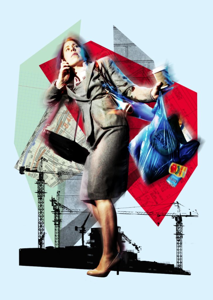
Suddenly the pieces come together and I’m moving in the right direction. Within an hour I’ve finalised the following design, and I send it to James with the message: “I can go in a different direction if you like and make it more open and abstract?”

He replies almost immediately: “Oh, now I really like that – though I am a sucker for cranes. I’ll share this with the team. Thanks for being so dogged!”
I realise that there’s no explicit reference to the travellators in the image, but this is covered by the accompanying brochure text, and I can reintroduce this element in the title typography for the poster and flyer. I make a couple of minor amends, darkening certain areas and adding texture. These are things people won’t necessarily notice in isolation but hopefully they will realise that the image somehow looks better overall. James jokes that he’ll run a ‘spot the difference’ competition in the office, and I receive one final email from him: “We all very much like this one please could you send it to Laura high res.”
The job is done. I breathe a sigh of relief.
Later that day I receive an email from Laura: “We also need it in landscape format.”
Simon Ford – March 2018